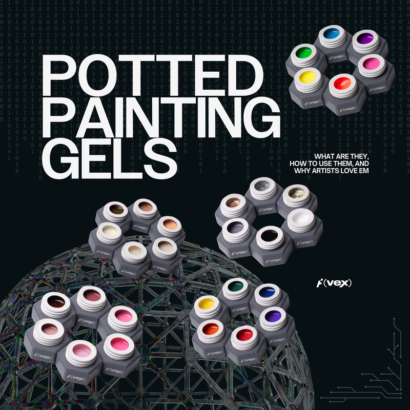
Six color stories.
Infinite sculpted glory.
One very whipped gel.
Not your gel-next-door, OILWHIP has ATTITUDE.
Each shade was designed to be mixed, sculpted, smeared, or swirled with total freedom and creative wild abandon.
And every collection? A starting point, not a rulebook. From goth romantic to frosted fairycore to retro-dusty neutrals, there’s a palette here that gets your weird little pigment brain spinning.
These aren’t stiff color wheels or matchy-matchy sets. They're personalities. Textures. Vibes. The kind of gel that makes you wanna layer a floral, then ruin it on purpose.
So the only real question is: which art era will you dive into with these?
The OILWHIP System: A Sculptural Gel Palette for Artists
Think of this like a modular kit. A toolkit built for brush babes, palette mixers, and pigment obsessives. Whether you're pulling off detailed realism or loose, dreamy abstracts, each of these collections gives you new tools to work with, not rules.
Without further ado, let's meet the OILWHIP collections in all their sculptural glory.
🩶 NEUTRAL COLLECTION
For the grayscalers, the sketchbook brains, the ones who mix before they paint.
This is your base kit. Your oil paint starter palette. Your moody little toolbox of monochrome nail art gels and sculptural base tones. Built for shading, tinting, and custom blends.

Color Story:
Classic artist primaries. Black, white, gray, and earth tones. Designed to be your OILWHIP foundation set.
Inspo & Usage:
Inspired by oil painting starter palettes and traditional underpainting methods, the Neutral Collection is essential for building contrast, depth, and custom blends. Use Titanium White to tint, Burnt Umber for earthy realism, and mix Onyx Black and Graphite Gray for shading and shadow work. Perfect for sketch-style outlines, realism, and vintage trompe-l’oeil effects.
SHADE DESCRIPTIONS | NEUTRAL COLLECTION
- ONYX BLACK: A deep, pitch-black shade with a bold, inky intensity, perfect for dramatic, high-contrast textures.
- GRAPHITE GRAY: A rich, charcoal-infused gray with subtle depth, mimicking the smooth smudges of artist’s graphite on canvas.
- TITANIUM WHITE: A crisp, pure white inspired by the go-to pigment in every artist’s toolkit. Ideal for highlights, blends, and striking contrasts.
- BURNT UMBER: A warm, earthy brown with deep richness, reminiscent of the classic pigment used in old master paintings.
- ANTIQUE OCHRE: A soft, muted ochre with a golden undertone, bringing warmth and a vintage, sun-aged glow.
- PARCHMENT VEIL: A delicate, creamy beige with a touch of warmth, inspired by aged parchment and sun-faded manuscripts.

🔥 VIVID COLLECTION
For the bold liners, the color-blockers, the ones who love bold, clean color.
This is your pop art punch. Your hyper-saturated dream. A full spectrum of high-chroma art gels made for maximum impact, crisp detail, and electric contrast. Not for the faint of palette.

Color Story:
High-impact primaries and secondaries, engineered for bold expression and visual punch.
Inspo & Usage:
A modern update on Fauvist color theory, these shades were made to pop. Use Cadmium Red and Dioxazine Violet for graphic art, pop art, and abstract geometrics. Aqua Bloom and Spring Viridian pair beautifully with black linework for botanical paintings and impressionist blends. This set is perfect for high-contrast artwork, ombré blends, and electric detail work.
SHADE DESCRIPTIONS | VIVID
- CADMIUM RED: A fiery, true red with intense vibrancy, inspired by the bold, statement-making pigment of classic oil paints.
- CADMIUM YELLOW: A rich, golden yellow that captures the warmth of sunlight and the luminosity of traditional Cadmium Yellow pigment.
- COBALT SKY: A bright, electric blue that mirrors the clarity of clear skies and rich cobalt pigments in fine art.
- SPRING VIRIDIAN: A fresh, vibrant green with cool undertones, paying homage to Viridian Green, a staple in an artist’s palette.
- AQUA BLOOM: A bright, tropical aqua that feels fluid and energetic, like a burst of oceanic color on canvas.
- DIOXAZINE VIOLET: A deep, moody violet with rich, inky depth, inspired by the classic Dioxazine pigment loved by painters.

🍑 PASTEL COLLECTION
For the pipers, the petal-pressers, the ones who turn frosting into fine art.
These are your soft-focus sculptors. Diffused, dreamy, and quietly chaotic in the best way. Build florals, candycore abstractions, and hazy gradient blends that look like they floated in from a watercolor dimension.

Color Story:
Soft-washed pastels with a dreamy, diffused tone. Hazy, sweet, and buildable.
Inspo & Usage:
These are your frosting shades. Ideal for 3D piping, floral work, whimsical characters, and soft-focus abstract designs. Azure Mist and Pale Wisteria feel like watercolors with a twist. Venetian Pink and Soft Terracotta pair beautifully with white for candycore or vintage motifs. Great for kawaii, cottagecore, or baby pink maximalism.
SHADE DESCRIPTIONS | PASTEL
- CELADON WASH: A soft, milky green with cool undertones, inspired by delicate celadon ceramics and watercolor washes.
- PRIMROSE TINT: A warm, buttery pastel yellow, reminiscent of early spring primrose petals and soft sunrises.
- SOFT TERRACOTTA: A peachy, sun-worn clay hue, capturing the warmth of terracotta pottery and desert landscapes.
- VENETIAN PINK: A classic, dusty pink with a hint of earthiness, echoing the painterly elegance of Renaissance palettes.
- AZURE MIST: A soft, powdery blue with airy undertones, reminiscent of misty morning skies and delicate watercolor washes.
- PALE WISTERIA: A whispery pastel lilac, as soft and ethereal as wisteria vines in full bloom.

👑 REGAL COLLECTION
For the gothic maximalists, the velvet romantics, the ones who paint like it’s 1620.
Baroque and brooding with jewel-toned drama. These are your lacquered finishes and oil-paint shadows. Each shade begs for detail brushes, gold leaf, and a little over-the-top energy.

Color Story:
Deep jewel tones and moody saturation with a touch of antique elegance.
Inspo & Usage:
Fit for royal portraits and gothic fantasy. Garnet Glaze, Velvet Fig, and Verdigris Gold bring a rich, opulent feel to any composition. Use these shades for baroque-inspired designs, romantic florals, or celestial motifs. Twilight Ink and Aegean Tide also work beautifully for nighttime scenes or smoky abstract compositions.
SHADE DESCRIPTIONS | REGAL
- GARNET GLAZE: A deep, luxurious red with wine undertones, reminiscent of garnet gemstones and old-world lacquered finishes.
- VELVET FIG: A dark, moody plum that feels plush and indulgent, inspired by ripe figs and rich velvet fabrics.
- VERDIGRIS GOLD: A muted, antique gold with a hint of green patina, evoking the aged elegance of bronzed statues and old-world art.
- CEDAR SHADOW: A deep, forest green with a shadowy depth, inspired by dense cedarwood and aged oil glazes.
- AEGEAN TIDE: A striking blue-teal, capturing the movement and mystery of the Aegean Sea’s rolling waves.
- TWILIGHT INK: A deep, inky navy with a midnight undertone, evoking the depth of twilight skies and thick oil-based inks.

🪵 EARTHEN COLLECTION
For the terrazzo babes, the slow texture builders, the ones who find beauty in grit.
This is your elemental palette. Stone, soil, moss, and memory. Made for raw materials, modernist structure, and that perfectly muted kind of drama that never asks for attention, but always gets it.

Color Story:
A grounded palette of soil, stone, and nature-inspired tones.
Inspo & Usage:
Perfect for organic textures and raw material studies. Think terrazzo, granite, moss, or woodgrain effects. This collection shines in minimalist art, texture play, or modernist abstractions. Worn Indigo and Aged Moss evoke a weathered, elemental look, while Sunlit Saffron can be layered for faux goldleaf effects.
SHADE DESCRIPTIONS | EARTHEN
- SUNLIT SAFFRON: A rich, golden yellow-orange, capturing the warmth of sun-drenched spice markets and aged oil glazes.
- RAW EARTH: A muted, taupe-brown with subtle warmth, reflecting the raw beauty of natural earth pigments.
- AGED MOSS: A deep, earthy olive-green, reminiscent of ancient moss-covered stone and aged patina.
- WORN INDIGO: A dusty, muted blue-gray, inspired by faded indigo textiles and vintage denim washes.
- VINTAGE MERLOT: A moody, muted wine red, embodying the deep tones of aged merlot and classic oil-based pigments.
- FADED ROSETTE: A soft, dusty rose, as delicate as dried florals and vintage silk ribbons.

🌞 SUNBLEACH COLLECTION
For the faded florals, the soft nostalgics, the ones who paint with ghosts and chalk dust.
This palette lives on the windowsill. Dusty, retro, and sun-washed to perfection. These shades whisper. They don’t shout. Think vintage linen, chalk pastels, and botanical shadows from a forgotten sketchbook.

Color Story:
Desaturated, weathered tones inspired by sun-faded fabrics, chalk pastels, and bleached botanicals.
Inspo & Usage:
These feel like forgotten sketchbooks left out on the windowsill. Lavender Fog and Washed Linen are beautiful for nostalgic compositions and vintage effects. Seafoam Patina and Lemongrass Haze give a whisper of color ideal for soft florals, antique frames, or dusty rose motifs. Great for retro-futurist designs, ghosted florals, or anything needing subtle contrast.
SHADE DESCRIPTIONS | SUNBLEACH
- ALMONDINE: A creamy, natural almond hue, inspired by sun-warmed stones and faded textiles.
- WASHED LINEN: A pale, neutral beige with a hint of gray, like the soft, timeworn feel of sun-bleached linen.
- LAVENDER FOG: A hazy, muted lavender, as delicate as morning fog rolling over a lavender field.
- SEAFOAM PATINA: A soft, weathered seafoam green, reflecting the gentle fade of ocean-washed paint.
- TERRE VERTE: A dusty, muted sage green, a classic earth pigment used by Renaissance painters.
- LEMONGRASS GLAZE: A soft, faded yellow-green, like sunlight filtering through wild lemongrass.

Which Collection Is Right for You?
- Love clean graphics and punchy contrast? Go VIVID.
- Obsessed with painterly florals or kawaii characters? Start with PASTEL.
- Want a foundational palette for sketching and mixing? You need NEUTRAL.
- Craving elegance, smoke, and mood? Try REGAL.
- If you’re a nature-lover or texture head, you’ll thrive with EARTHEN.
- Prefer soft neutrals or muted tones? SUNBLEACH is your muse.
And the magic? You can mix across all six. Try blending PASTEL with VIVID for dreamy high-contrast petals. Or layer NEUTRAL under REGAL for museum-level mood.
Curious how we made a gel like this even exist?
Read the full story behind OILWHIP’s formula, texture, and sculptural glory → OILWHIP vs. Traditional Art Gels: What’s the Difference?
How to Shop the OILWHIP Launch
- Explore all six collections here
- Grab a curated set or mix and match singles
- Whip over to Instagram, @functionofvex, and share your looks
We can't freaking wait to see how you sculpt it.


